Paint is tricky. Paint changes based on the lighting in your home. Paint changes with season. Heck, paint changes with the time of day.
It's my professional opinion that you save the paint color for the last step if you are redecorating. Often, I will see people who already have a paint color picked out and will try to work around it with sofas, chairs, even wood pieces. Honestly, more times than not, that limits us.
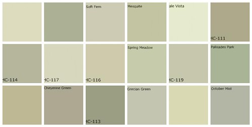
Ivories can take on yellow, peach, greens, and even golden tones.
Greys will become purple, blue, green, and brown.
 |
| http://farm4.static.flickr.com/3396/3414194807_c7a6250245.jpg |
Save the paint for last if possible. Paint will be the canvas for your beautiful furniture and set the mood in your home. If you're purchasing new furniture you want to let the stars shine.
So what happens if you already have your furniture and want a fresh look with new paint? Try to pull a neutral shade from your accessories. Or, if you want to add color you can do a lighter shade and accent with the brighter tones.
I love that paint stores will let you sample the paints these days. It takes some of the fear out of a paint purchase. If you don't want to purchase those samples, take home a few paint chips and tape them to the wall. Leave them there for a couple of days to see them in all types of lighting throughout the day.
You don't need to paint every room in your home the same color but it does need to flow. If you have an open floor plan with rooms looking into each other, I often recommend using a color that is on the same paint swatch either a shade lighter or darker for subtle contrast. If you're a color person, it's important that the colors are in the same category. For example, if your home has primarily warm tones it's difficult to incorporate a cool grey. Take a look at some of these color schemes that are fantastic- both neutral and colorful.
 |
| I especially love how the designer painted the backs of the bookcases a contrasting color, The taupe picks up the color of the taupe chairs featured and balances the room. It, also, acts as a beautiful backdrop for the white pottery. Interiordesignforhouses.com. |
 |
| A beautiful, neutral palate that lets the furniture shine. The paint acts as a wonderful contrast to make the headboard and artwork really stand out. |
 |
| A cool contrast using contrasting colors that compliment each other, The yellow on the top lightens the room and draws your eye upwards making the room appear taller and adding visual interest. |
 |
| A contrast using monochromatic theme. This is an example of using the same color family just a shade lighter or darker. |
 |
| Staying in the warm color family of earth tones. When choosing an accent wall make sure it is a focal point and is large enough to make a statement. |
All photos are featured on the www.Benjaminmoore.com website
No comments:
Post a Comment